Affinity: Connectivity Rapid Exploration Tool
Acknowledgement: This work was begun in collaboration with Dr. Nick Foti and Dr. Emily Fox from the Department of Statistics, for the 2016 spring quarter class of CSE 512 taught by Professor Jeffrey Heer.
Abstract
Neural connectivity data often exists in a high dimensional space, with multivariate attributes for each edge between different brain regions. Visualizing a connectivity matrix, looking for trends and patterns of interest, and subsequently dynamically manipulating and drilling down these values is a challenge for scientists dealing with data from various modalities such as magnetoencephalography and electrocorticography. There exists a need for a lightweight, open-source, easy to use visualization tool to allow for the rapid exploration of these connectivity matrices. Here we present a client-side visualization tool written entirely in HTML/CSS/JS that allows for the in-browser manipulation of user defined files for the exploration of brain connectivity. End-user feedback from domain experts suggests that this will be a valuable tool for revealing underlying trends in connectivity data, and presenting these results to others in the field.
Software
Try our visualization online here.
Tutorial
The online visualization is preloaded with a data file, but using the drag and drop interface, a user can input a desired file of choice. Included in the code repository is a .py file that will process a python numpy connectivity matrix file and output a text file in appropriate JSON format for loading into the browser. Data is in standard JSON nested array format, and some real-world datasets from patients are located here.
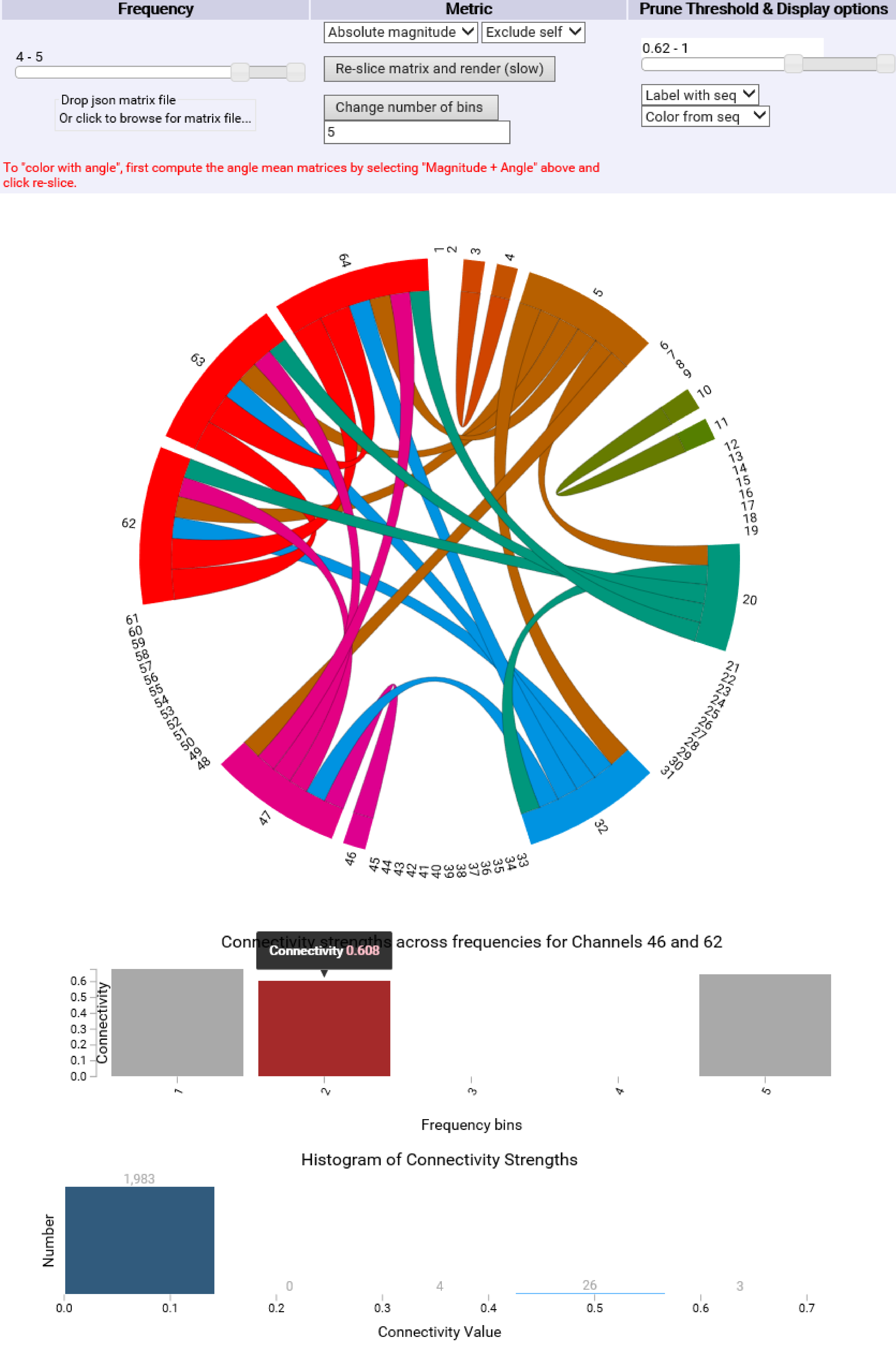
The user selects a frequency range of interest, a statistical measure of interest (absolute value or magnitude and phase information if present), the inclusion or exclusion of self connections, and then presses the "re-slice matrix and render" button to submit the query and update the chord diagram.
The user then can select a range of threshold cut-off value. This in real time dynamically prunes connections below a certain strength from the diagram.
The user then has the option to color the chord diagram based off of anatomic locations from a file (if present), or in a constant luminance scheme based off sequential order.
Once the chord diagram has been setup for visualization, the user can hover over a node or a chord to display connection strengths for that node, or between the two nodes specified by a given chord.
Upon clicking a chord, a bar graph will dynamically update which displays connection strengths across all frequencies for the two nodes of interest. By hovering over any bar in the chart, the connectivity strength will be displayed.
A histogram displaying all the mean connectivity strengths for a given set of frequencies is generated after each "re-slice matrix and render", which displays to the user the total number of pairwise connectivities that fall within a user-specified number of bins